Laser, Graphics by Marian Bantjes Image from Wallpaper |
Having done my thesis with research invested heavily in hull construction, it always dealt with the reading of surface as simply surface. I think it's oft neglected how graphic application can also influence the formal reading as much as the physical surface itself. That said, I think it's a wonderful approach to boats and design and perfectly in concert with the original concept of the Laser.
Standard Laser (courtesy of Wikipedia) |
For those of you that aren't as familiar with sailing, the Laser is one of the most popular sailboats in the world. Designed by Bruce Kirby and Ian Bruce, the Laser was first released in 1971. The intent was to create a simple single-handed vessel that could be easily transported by car. It's inexpensive and very accessible for beginner to advanced sailors. As it's simple, racing these boats is a clear example of the skipper's abilities. They are mostly raced in one-design competition, meaning that the boats are identical (no other models). The Laser is one of the designs in Olympic competition sailing.
Personally, it's one of the really fun boats to sail as it's so simple. There's such a strong and visceral connection to what the boat is doing. It's great also in that you see kids sailing them at summer camp and adults that are very very serious about racing them as well.
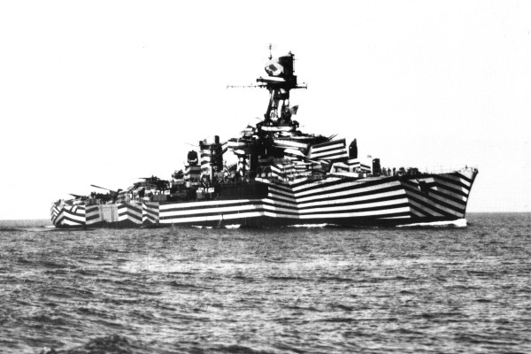
French Cruiser "Gloire", WWI Courtesy of gotouring.com |
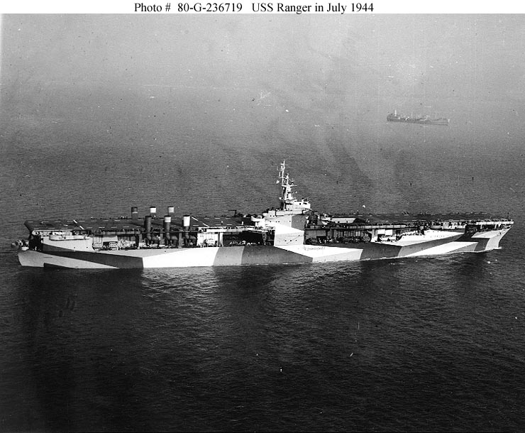
But how's this all design related? Going back to Marian Bantjes graphics, I was instantly reminded of some photos I recalled from childhood. As a kid I was fascinated (like most young boys) by military machinery. Patterns of camouflage were painted on ships to help obscure their size, heading, and speed. Known as dazzle camouflage, the patterns seem rather inconspicuous but were prevalent in WWI and II. Maurice Friedman, a graduate of RISD, began designing many of the Dazzle designs for the United States Navy as a member of 4th district of the U.S. Shipping Board, Emergency Fleet Corporation (a precursor to the Merchant Marines).
Friedman recently had a retrospective after his work was donated to RISD posthumously. The exhibit was held at the Fleet Library at RISD in winter 2009. The exhibition website can be found here. Some of the designs are quite startling but beautiful to look at. If you really stare at it, you can start to see how the designs really do obfuscate the reading of the mass by breaking down the objects and how you typically read tectonic continuity. This is of course the basis of all camouflage. The US military recently embarked on new camouflage which is more commonly known as "digital camouflage".
The MARPAT is the US Marine's version of the digital camouflage. More info and an article w/ actual empirical data (though I'm not sure how peer-reviewed this is) can be found here.
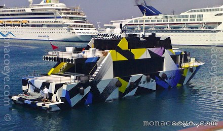
Jeff Koons also embarked on a little boat painting recently:
From Monacoeye |
Rather than going on and on, I'll let Maurice Friedman's drawings speak for themselves. I think there's a lot of potential for this strategy to be exploited in an architectural context.
Other images:
More Reading:
Navsource: images database of ships
and of course, Wiki, Dazzle Camouflage


As it's simple, racing these boats is a clear example of the skipper's abilities.www.performqanceautocarrier.com
ReplyDelete